

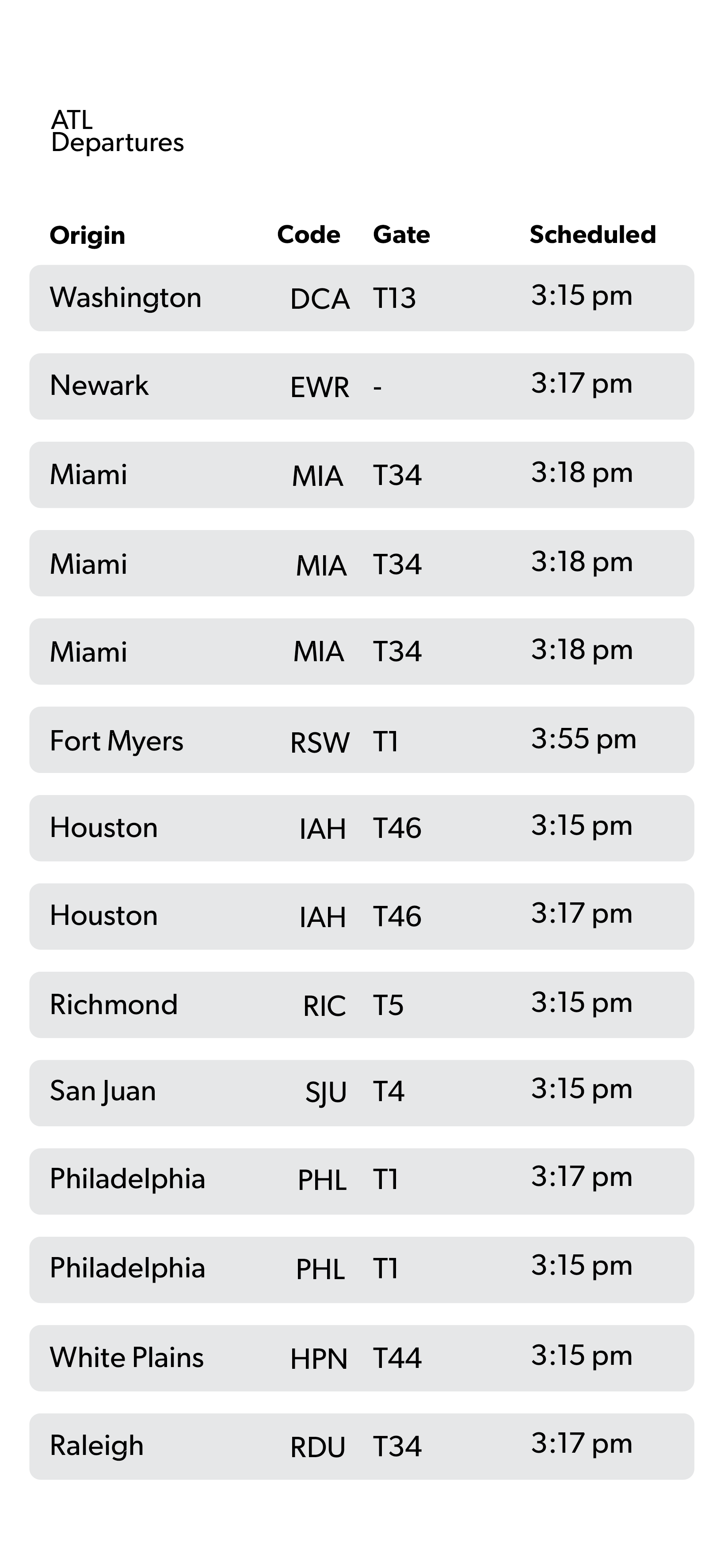
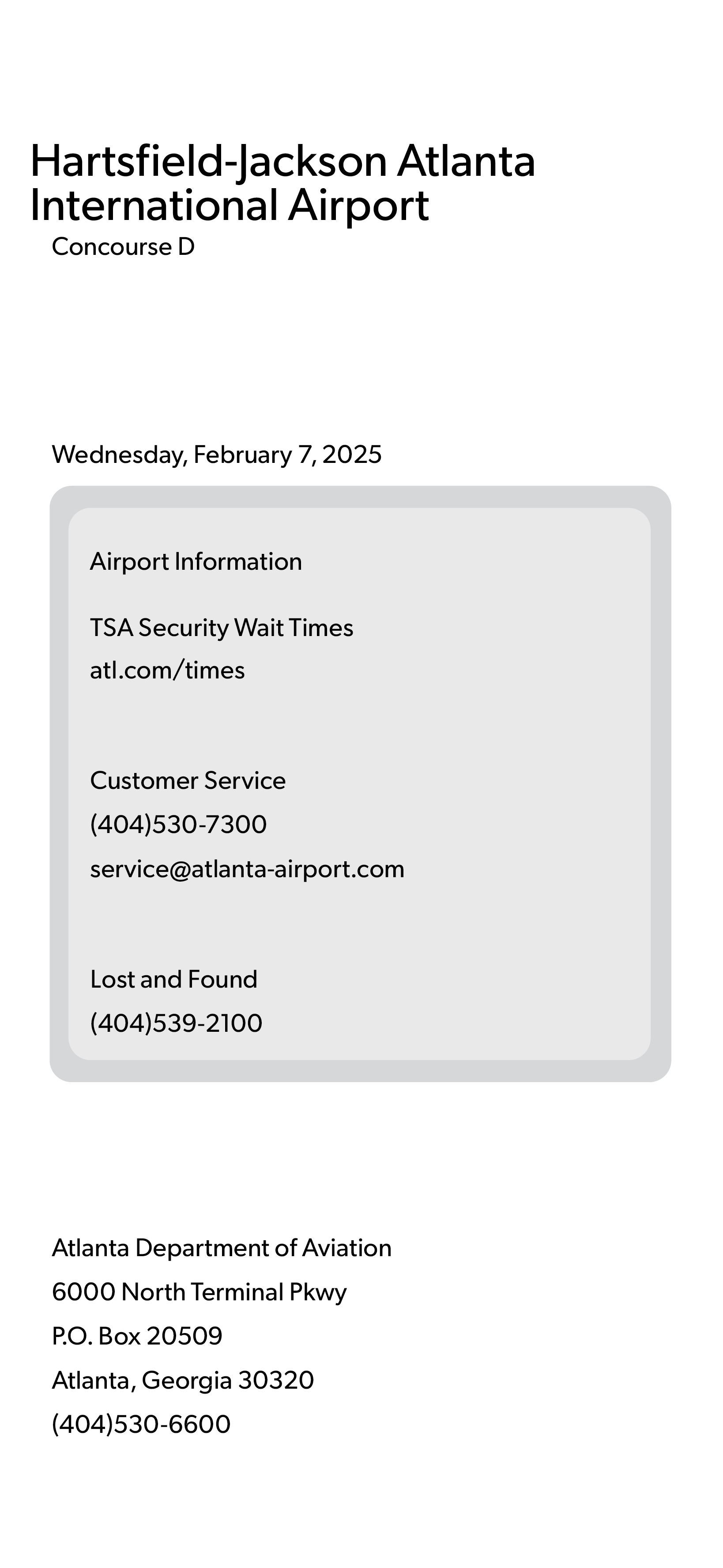
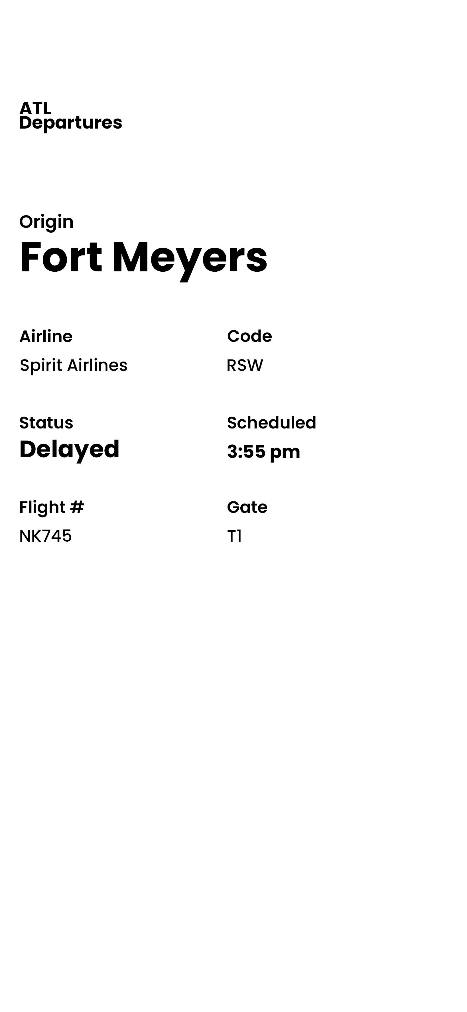
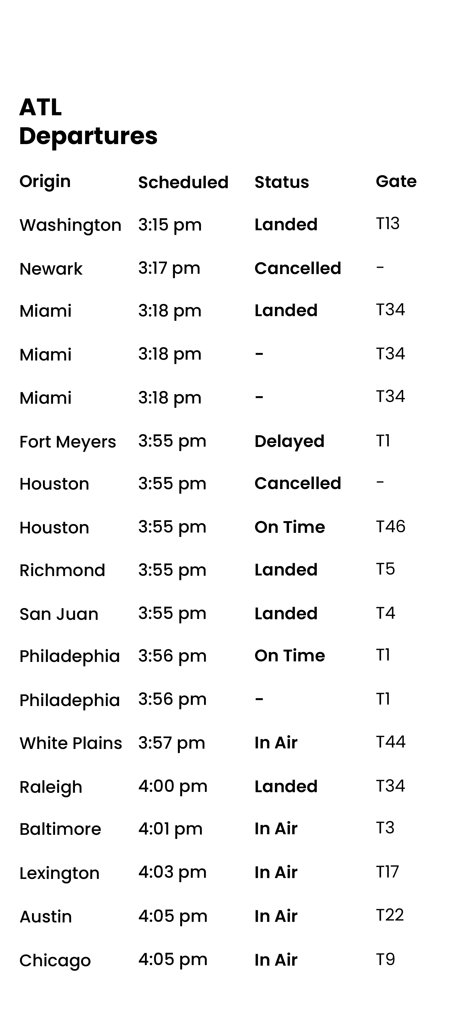
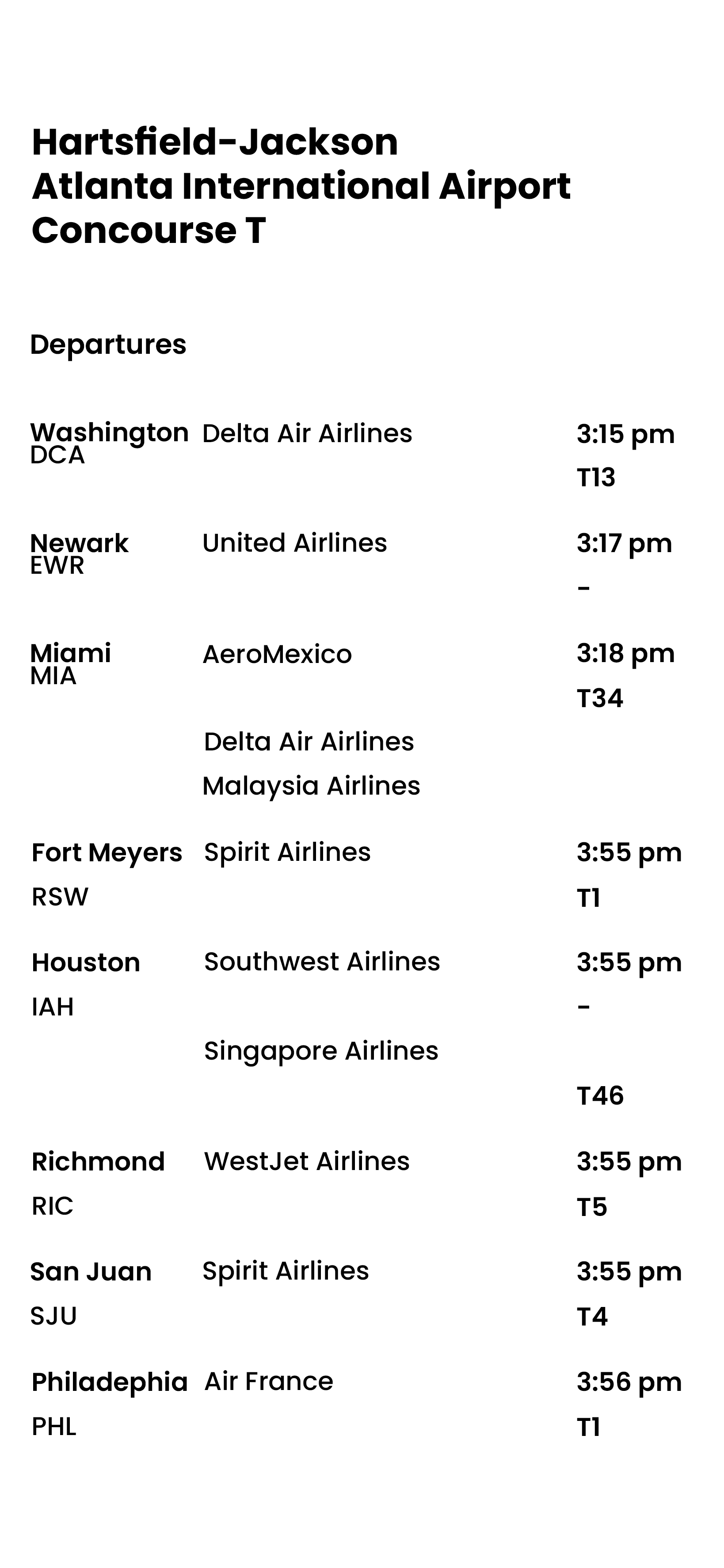
For this project in Typography II, we developed an interactive flight information display system. This system (an app) was designed for phone use, providing passengers with flight information as needed.
This project helped me develop my typographic skills and explore how they enhance readability and legibility for viewers. Some of the focus points for this project were tabular hierarchy,
numerical data, imagery, and potential symbols.


Early Stages
The images above show my first attempts at laying out all the information provided and required. At first, I felt very overwhelmed with how I was going to create a hierarchy. I was unsure what I felt should be highlighted most, so I tried a few different positionings.
It was important to find good spacing and figure out the shapes. This was a crucial step in the right direction, with guidance, of course. One thing I really focused on was designing for functionality, rather than just aesthetics.
I had a perfect image in my head of how I wanted the app to look, but executing it was a challenge. Peers and my professor reminded me to remember the hierarchy and hone in on it. At the time, I struggled to understand where things should go and why minor adjustments were necessary.


More Iterations
Each of those past concepts was made with guides and a baseline grid. This aspect was extremely helpful, especially when there was abundant text that needed to be displayed. Although these images show improvement, you can still see that I needed to work on the word and letter spacing.
However, during this time, we were told to start coming up with a color palette for the app. Branding was also a large part of creating our apps. Although the entire class was using the same airport (Hartsfield-Jackson Airport in Atlanta, Georgia), we were all encouraged to find different ways to design the app to sell the airport and its software to more incoming passengers.
Adding Color and Brand Identity
Our professor gave us a lot of creative freedom when it came to our color scheme. However, she emphasized that the colors needed to be affective. They must maintain readability and accessible legibility.
Another critical aspect had to be the font. Just like the colors, the font choice is not an easy process. I was lucky enough to come across Gibson, which ended up being effective and also fitting with my theme!
-

First Experiment with Color!
-

-

-

-

Primary Color
#CEE9DD
-

Secondary Color
#D1ECED
Once I had my chosen colors and font, I had to focus on the hierarchy more than ever. In addition to making some changes, I also had to improve my letter and word spacing to make everything balanced.

Finally…
After a lot of moving around, hierarchy work, spacing, and more, I finally felt confident in my final version of the app. Check out the more interactive version HERE!
Keep scrolling for each individual image.


