

Typographical Poster Design
Typography II This project will focuses on the manipulation and arrangement/composition of typography and image as it conveys messages through a poster series. Students will develop three posters that persuade viewers to attend a series of events. Each poster will communicate the meaning of a person's work contribution.
Another intended purpose of this project was to be able to find ways to represent something that may or may not be familiar to you through design. I really enjoyed deep-diving into the worlds of unfamiliar poets and researching their stories. I was able to configure multiple sketches and concepts of my final design in order to see what was most effective.
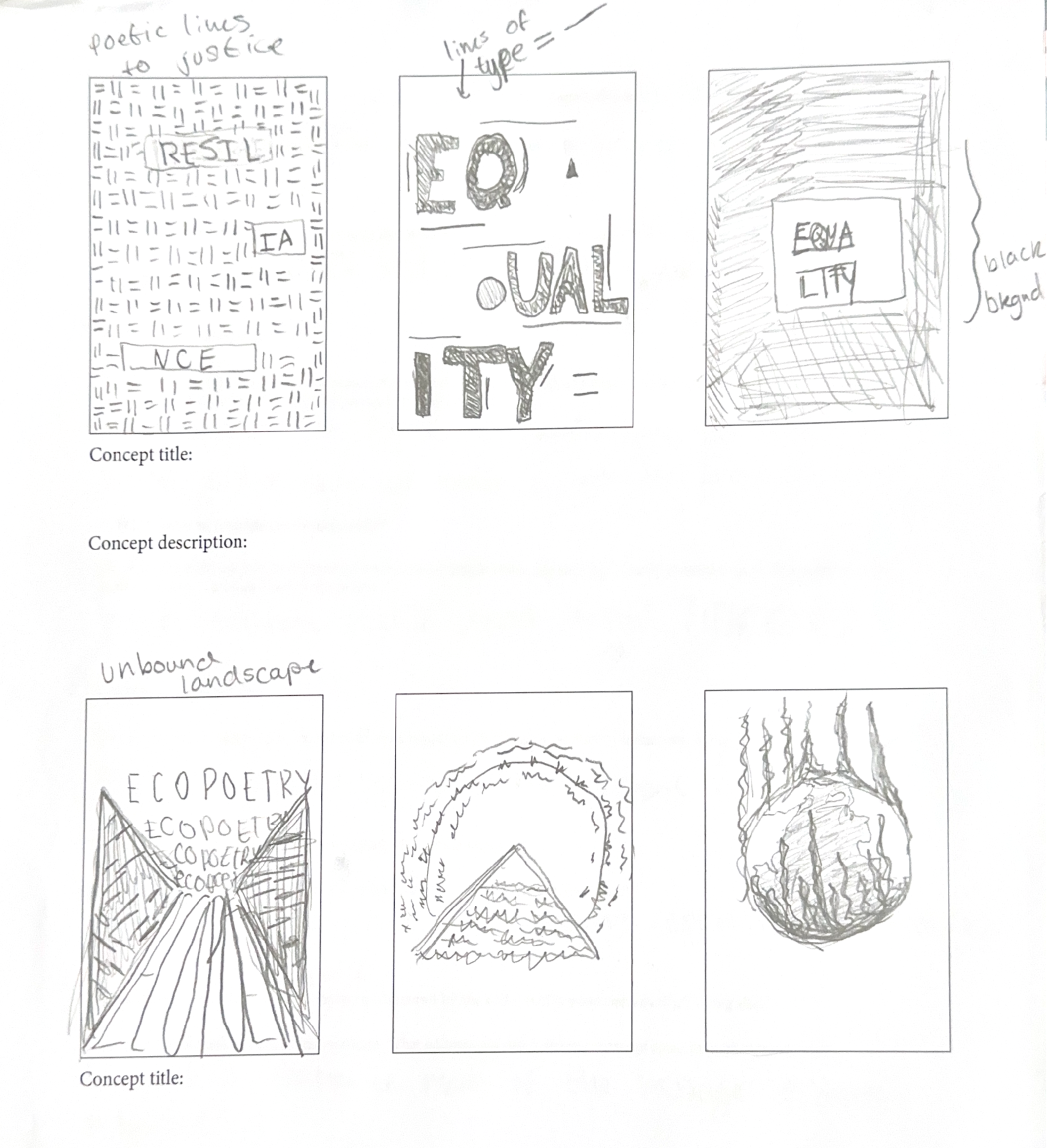
Below, you will be able to see my sketches, concept ideas, and iterations.
Meet The Poets
-
Kari Gunter-Seymour
Founder/Executive Director of the Women of Appalachia Project
Frequently raises awareness on Appalachian culture and the class system set within society in the U.S.
-

Russell Atkins
American poet and playwright
Introduced new poems, music, and plays in order to stand out and avoid traditional art that didn’t reach all audiences.
-
Yalie Saweda Kamara
American writer, educator, and researcher
Discusses the class divides and other racial challenges that people still face today. She also talks about her faith frequently as well.
Let’s start from the early stages…
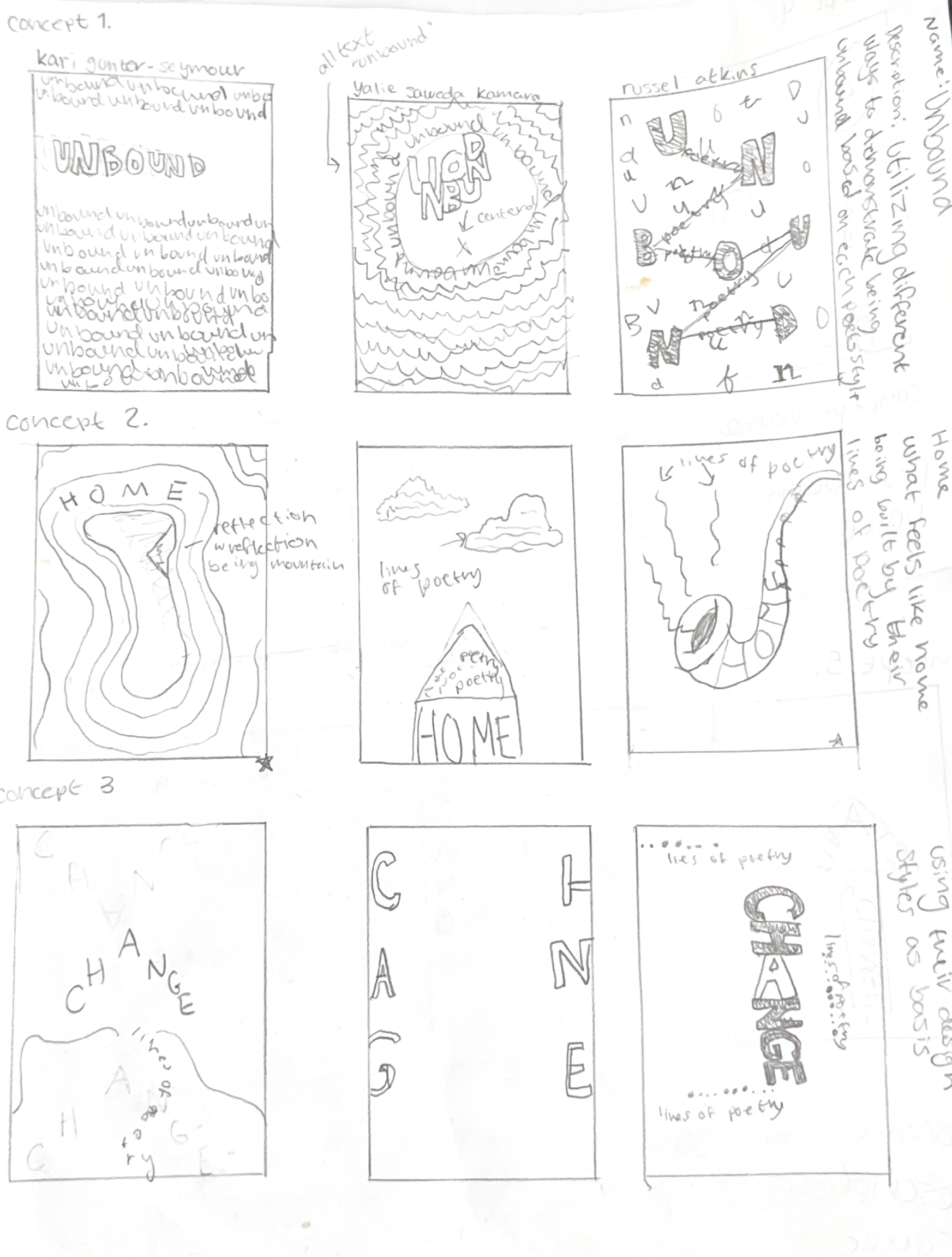
At the beginning of this project’s journey, we began getting assigned our poets and researching them. Doing so would further inform us on who and what we are using to represent a larger message. Each poet had a unique story while also falling adjacent to two others for each group. My assigned theme was Unbound Landscapes: Ohio's Poetic Threads.


Beginning
At the beginning of this design process, we students were told to use physical media and creativity to create posters based on our assigned themes. We were also instructed to come up with brief ideas on concepts as well as descriptions to explain how our design tied in with the theme. I enjoyed experimenting with different materials; however, I hadn’t researched my poets thoroughly enough, which initially created a disconnect between my alignment with the themes and how the designs represented them.
As I spoke with my peers and professor, I realized my small mistakes at the beginning. However, that gave me the opportunity to take all of my constructive feedback and make it into a vision that I was slowly piecing together in my head. I had so many ideas at once, and it felt like they were all merging!
Through further research, I began to come up with clearer ideas I wanted to incorporate into my designs. I was encouraged to start back at the beginning stage, sketching. This helped ground my designs more effectively, as I used to jump straight into my work without a set plan.
Now that I had everything I needed, I was able to take my ideas and run. I enjoyed that each group of poets was assigned to a group of 3-4 students. Therefore, during peer reviews, it was really helpful to discuss my ideas with my group members. Seeing their point of view and different design styles was very valuable for me as a part of the design process. I gained different perspectives and saw how other creative minds work.
More sketches
My design journey through sketching was extensive. I was constantly getting great feedback from my peers and professor. Though during this time, I did struggle to find a clear concept or theme. I had it in my head, but executing it at first was quite difficult for me.
Finding a way to connect each poet to the other was quite simple for me; the main challenge was how to accurately design all three of their posters while telling their story.
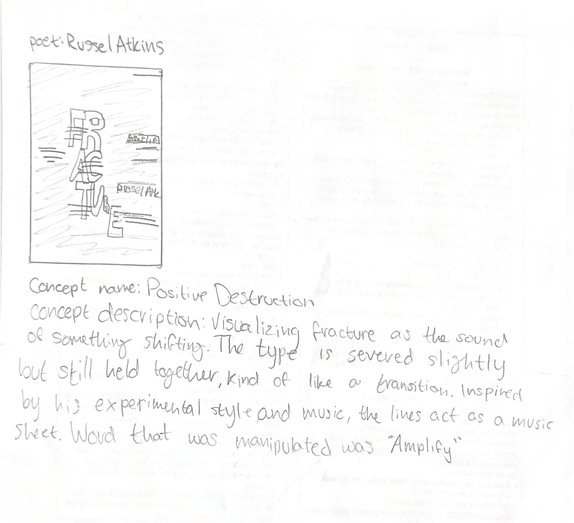
To start imagining my design in Adobe Illustrator, I drew inspiration from my concept of Positive Destruction. I wanted to personify my design based on my concept description that focused mainly on being severed but still maintaining its position (metaphorically in society).
Though the experimentation was fun, and I was more than ready to bring my design to life through Illustrator. It ended up being an unsuccessful attempt. The design still felt too distant from the message I wanted to convey.

Refinement
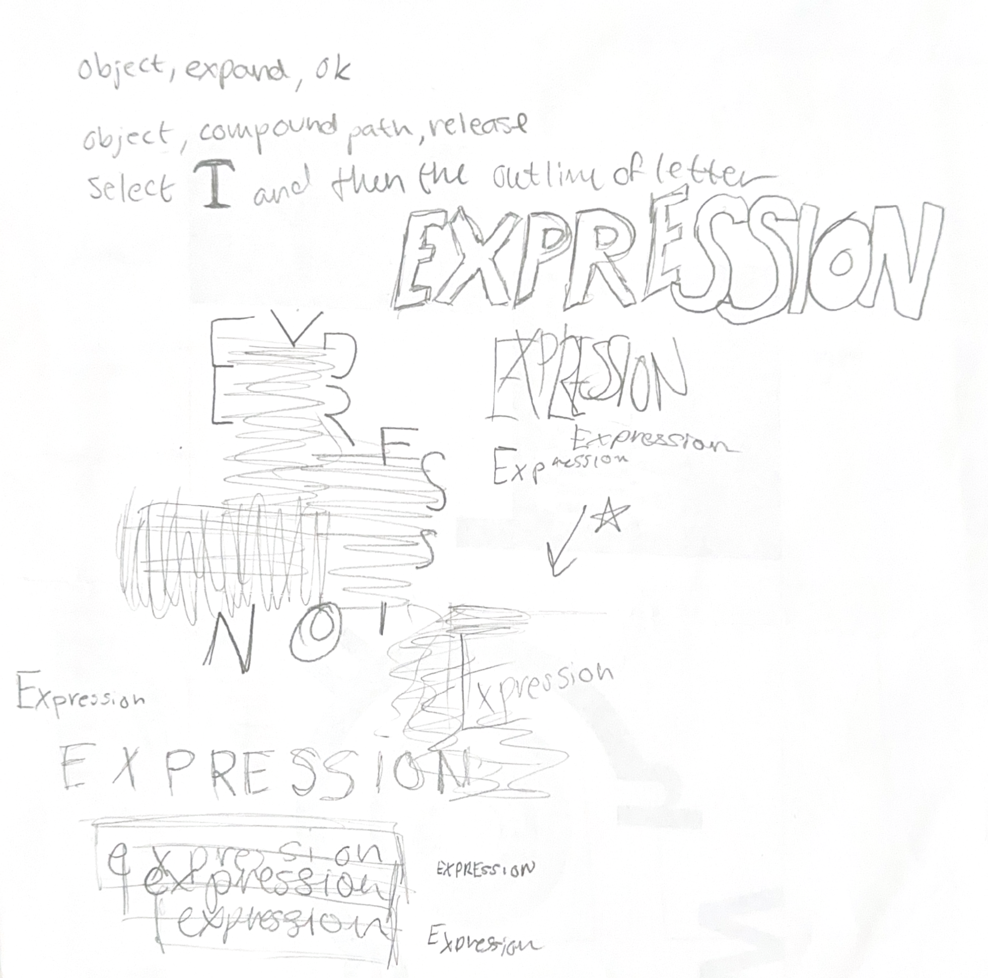
Through numerous trials and tribulations, I began to get a more solid idea of my concept. Positive Destruction led me to the right place. Although using the word Fracture for Russel Atkins ultimately proved unsuccessful, I started heading in the right direction. After speaking with my professor, we decided that using the idea of expression could be very effective. After all, the poets were all quite expressive when it came to their work or their outspokenness on real-world issues.

Final Concept
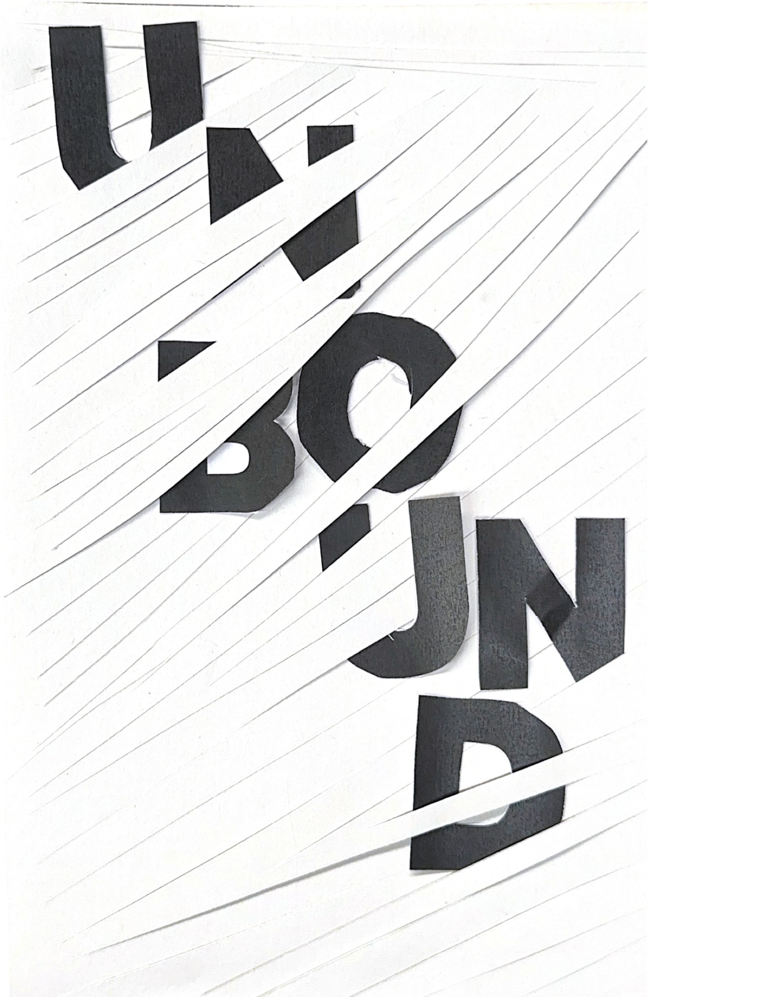
After some more one-on-one meetings with my professor, the theme Positive Destruction had morphed into Constructive Destruction. The name was thought-provoking and felt like it perfectly matched my vision for how I wanted to continue my final iterations. The image to the right is my full explanation.
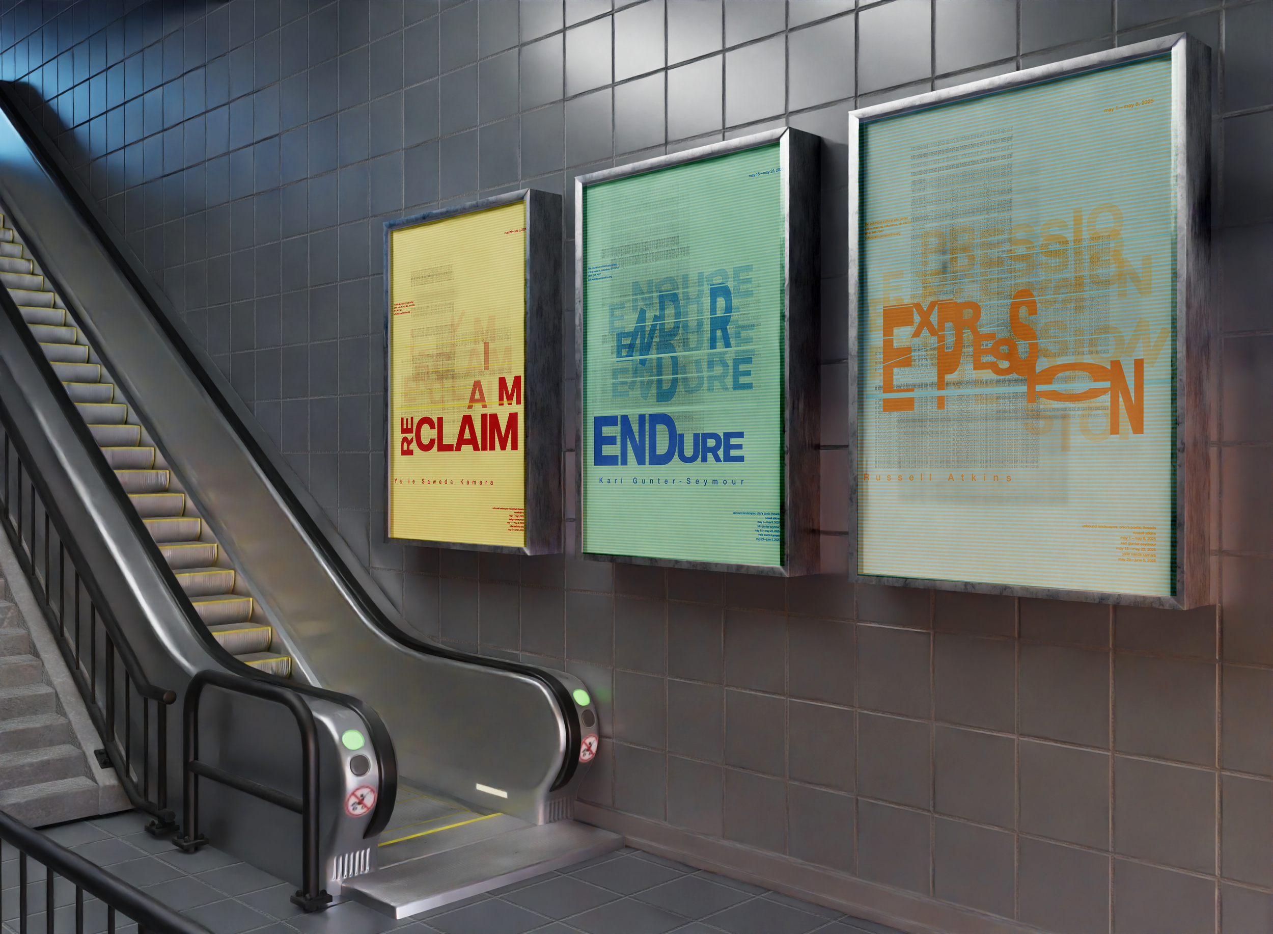
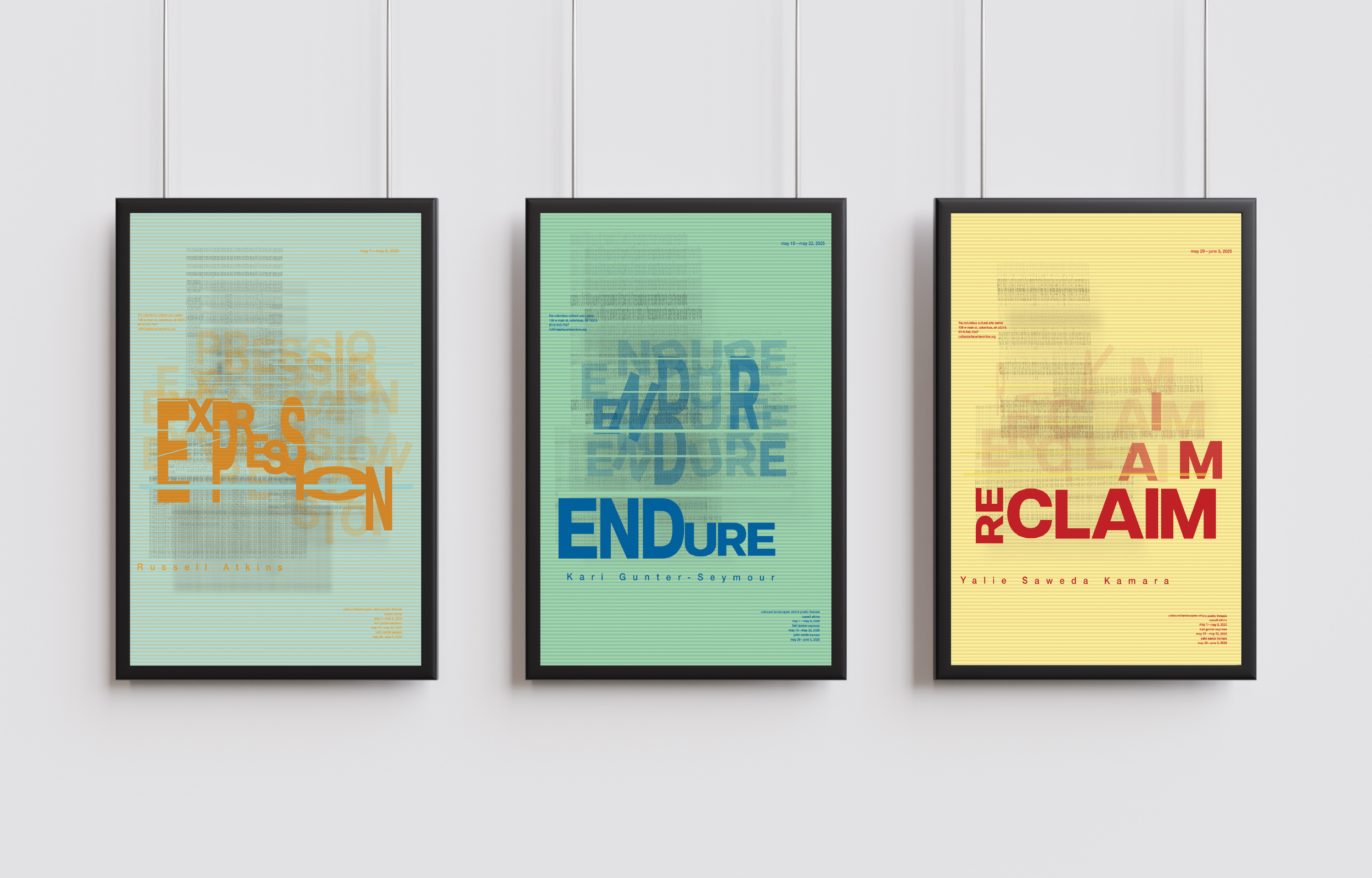
Final Version
The final result has many aspects that I had previously used. I enjoyed the opacity and Gaussian blur effect as it felt representative of each poet’s voice being tuned out by society. As my method description goes, I utilized type to demonstrate the societal ridicule against my assigned poets and other figures like them. I used the Gaussian blur to hone in on the idea of blurring the lines of social expectation. Of course, Constructive Destruction was finally cleaned up to highlight the tension between destruction and rebirth, ultimately. In a way, the letters and words for each poster are supposed to break out of their confinement. The blurred lines of type they are breaking out of are negative ideas towards each poet.
As I look back on this project, I believe it still needed more work. However, I would not have been able to finish this project without the help of my group members and my outstanding professor. She provided me with a lot of creative feedback, and I learned a great deal about type and design from this project. I am looking forward to using this project in reference to my future work and seeing how I’ve progressed.