
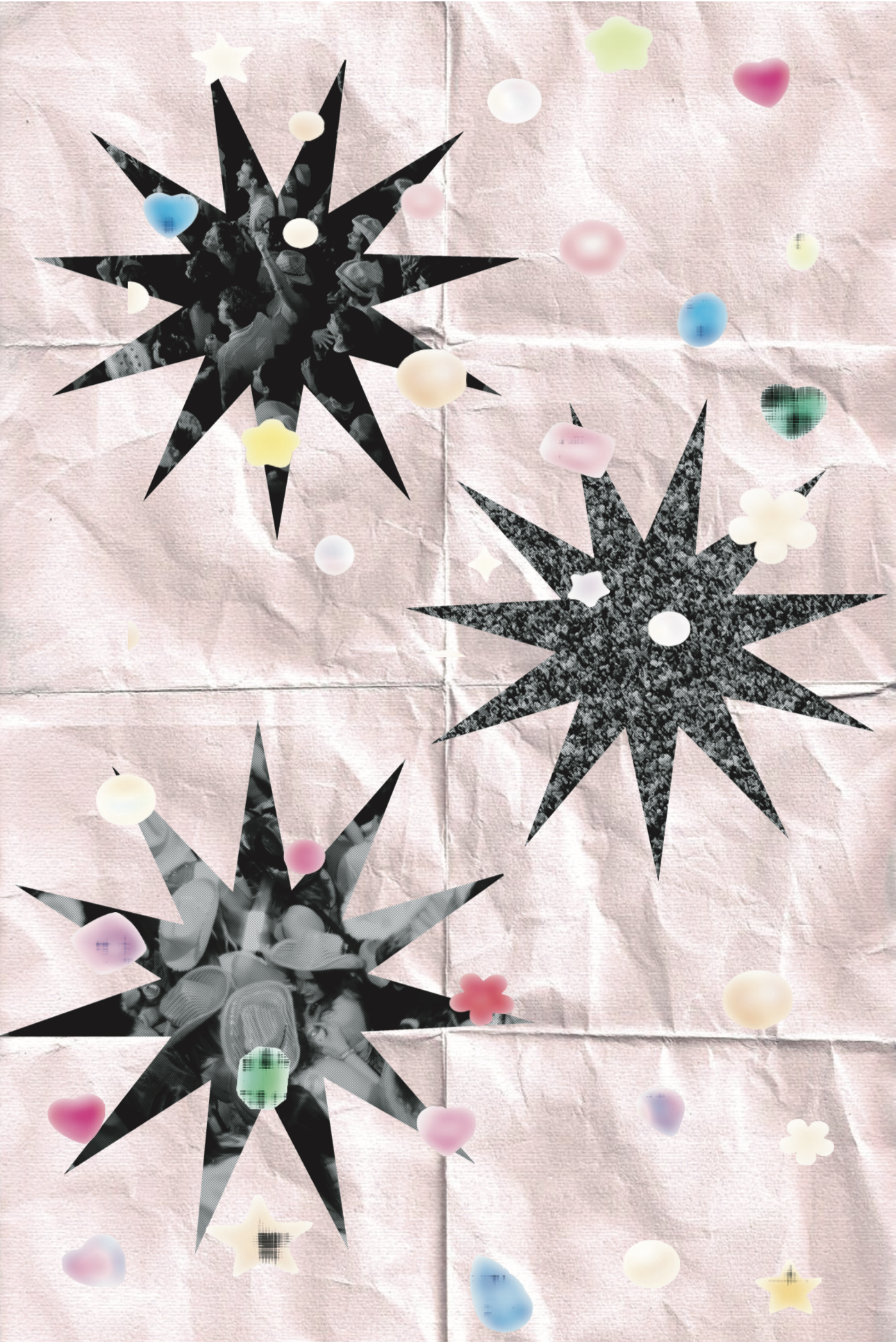
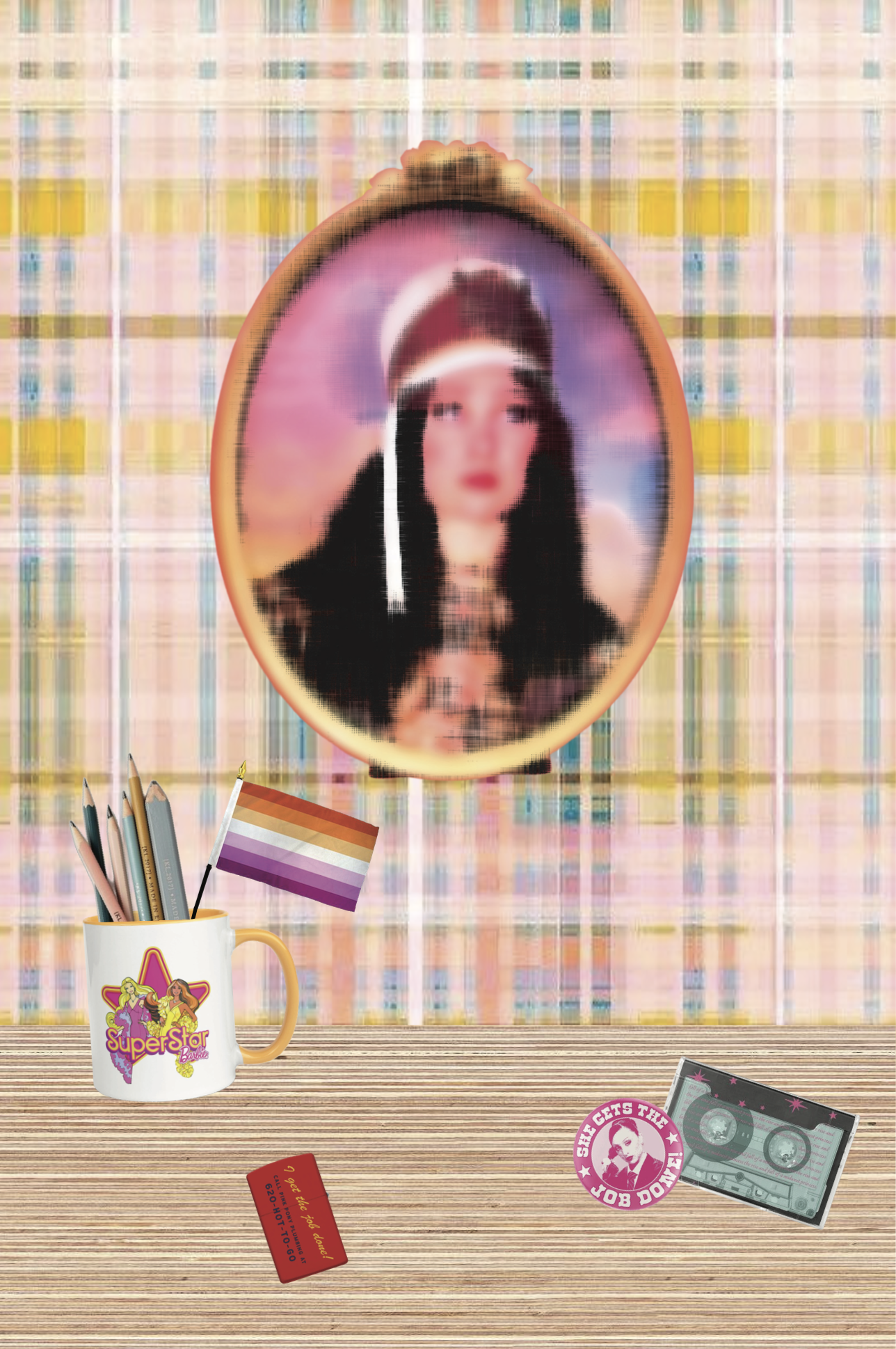

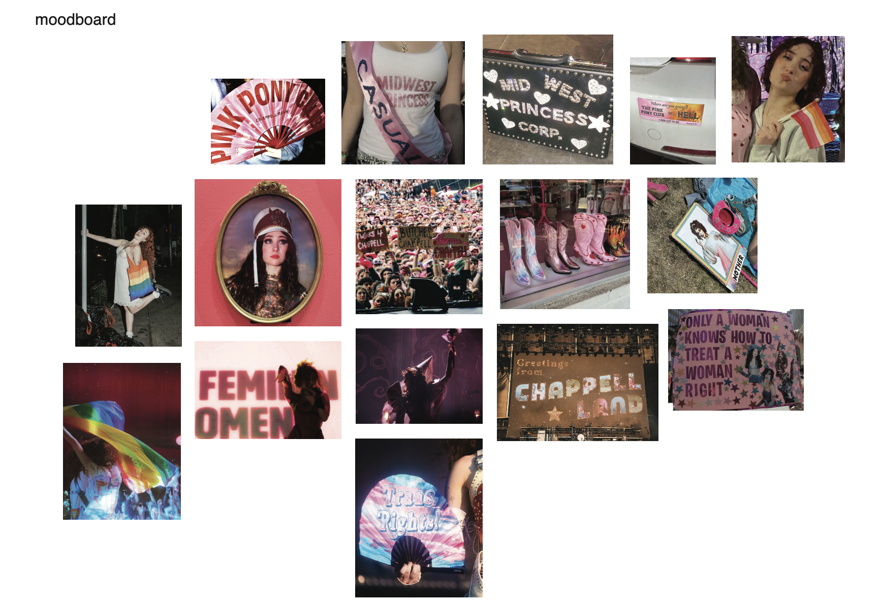
This project was for my Design & Meaning class. We were to choose from a few formats for our final project, so I chose a poster series. The series was themed by a community that I have been apart of. The community I selected that I am a part of is Chappell Roan’s fandom. Her brand has always had a very unified aesthetic thanks to her best friend/collaborator/graphic designer, Ramisha Sattar. This visual language that represents Chappell as well as her music and brand is very clear on what it stands for. A majority of her music, fans, and visuals highlight diversity in sexuality and create a safe representation for those who align with her. Chappell tends to have a very crafty audience, which is reflective of her performances. She hand-made all of her stage costumes for years, encouraging her audiences to partake in themes and DIY their costumes. To this day, her fans go all out for shows, including cowboy hats and boots, feather boas, and more. With this poster series, I really wanted to reflect the real, raw, and crafty aspect that ties her and her fans together. Those scrapbook-esque visuals highlight these themes throughout and also reflect her feminine, sapphic themes as well. I also really wanted to represent a large crowd visual. A huge part of her legacy (thus far) is how many people she can bring together anywhere around the world. Her impact, which has been on the rise, is already largely obvious. I also wanted to make this fan/artist relationship to not feel parasocial and more like you are supporting a part of you that has wanted to be shown for a long time. Chappell also is very interactive with her crowd, especially with her most popular song, HOT TO GO. Adding in those interactive tones throughout this also aids in showing that this community is not one to be seen as “parasocial.”